For the past month, some friends and I have been secretly working on a comic/zine project named Soup Rocks which we brought with us to the Packing House Zine Fest in Claremont, CA. Soup Rocks is about a man that discovers rocks in a can of soup and his journey to find out how they got in there and more importantly, why. The comic features illustrations by Danni.Artspace with backgrounds and shading by yours truly.
 |
| Photo by Danni.Artspace |
During the process of making the zine, I learned a few things which I would like to pass on to anyone that would also like to make a zine, whether it’s a comic or not. While Soup Rocks isn’t the first time I’ve dabbled with zine making, it is the first time I have done so in a completely digital space at the typical half page scale. Usually, in the past, when I’ve worked on zines it has been in the more traditional cut and paste style, which is a pretty awesome way of making art, however, it’s not what I’ll be covering today. Maybe some other day.
 |
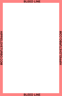
| Half Page Zine Template |
For this project we used the standard 8.5 x 11-inch letter sized paper, folded in half, which I’ve seen called the “half zine” or “digest sized” format. For the most part, this is the most common and simplest format for zine making. Most online resources suggest using a quarter inch border around your pages and although that may seem large, especially when you consider the limited amount of space of a half sheet of paper, I found it to be a perfect margin. You’ll have enough room to trim any excess and your content won’t disappear towards the page folds.
 |
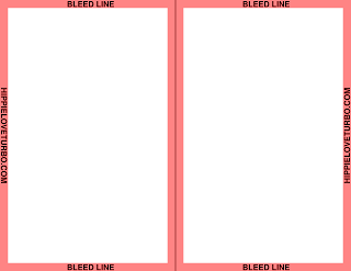
| Unfolded Half Page Zine Template |
At first, Danni and I followed a random template I found online, but as we got closer to printing the zine, I discovered that the template was slightly off and each page would either feature too heavy of a margin, would not line up when folded in half, or would be stretched in an unusual way when fit to page. Eventually, I created a new template using Gimp. Sure, you could figure out a more elegant way of setting up your page to feature margins, but the way in which Danni and I were bouncing around between various software, sending artwork back and forth via email, and scaling comic panels, following a simple template was easiest.
One of the most important things to consider while making your zine is your page count. In our case, we knew that we wanted 16 pages for the story, a full color cover and back, a page for advertising our upcoming visual novel and a page for advertising my radio show. When you create your zine you must keep in mind that your page count must be divisible by 4 or else you’ll have blank pages.
For economical and aesthetic reasons, most zines are black and white. If you want to add a splash of color, I suggest printing the cover in color while leaving the inside black and white. In the past, I have also added color by printing the cover on construction paper or colored printer paper. If you do print on colored paper, I suggest using a lighter or brighter paper because darker paper tend to make your photocopies more difficult to see. Because we only used double-sided color prints for our cover, back and inside covers, we made sure to place our visual novel ad on the back inside cover. This maximizes its importance and takes advantage of what little color our zine had.
When you are formatting your page order (pagination) for printing, things can get a little confusing. While trying to format our comic’s pages, I followed the advice of others online and tried to use Scribus, an open-source desktop publishing software which helps you determine how to format and print your pages in the correct order. While setting up Scribus I felt like I was using a sledgehammer to drive a nail while building a birdhouse. In other words, because our zine only needed 6 sheets of paper, totaling 24 pages of content, using Scribus felt like overkill. Instead, I folded 6 sheets of blank paper in half, labeled each page with a pen and then unfolded the paper. Now I knew how to format each page for printing. Later, I found some word templates on Anatomic Air Press’ website which could also be helpful, even if you don’t print from Microsoft Word. You can just follow the page order. There’s also a handy picture on Aisling D’Art's website.
The printer we used could print double-sided pages, however, if your printer doesn’t, you can simply print out your pages, flip them over, and print the other side. Just keep your page’s orientation in mind. Sometimes, even if your printer can print double-sided, it’s faster to run a whole group of pages and flip them manually. Before running prints of your whole zine it’s worth taking the time to print a test run. Even if you think everything is perfect, you might’ve missed something and any mistakes can cost you time, money, or goof up your presentation. Might as well catch mistakes while stakes are low.
One thing that was somewhat unfortunate, is the printer we used couldn’t print edge to edge, or print with zero margins. That meant that our cover pages had a slight white border. Earlier I mentioned that you should use a quarter inch margin and, in our case, that margin came in handy as we trimmed off the white boarder from our cover.
You should always try to trim your zine after you’ve folded and stapled it. Using a bone folder to crease your page folds helps minimize how much your paper will need to be trimmed. Trimming your zine makes it look more professional because aligning your pages perfectly while folding is more difficult than trimming them to a uniform size. If you don’t feel like trimming at all, try making a cover that doesn’t have an image extend to the edges, in a similar fashion to your inside pages.
Speaking of trimming, oh boy, was that the most annoying aspect of this project. I naively thought that finding a guillotine style paper cutter would be no problem. I tried hitting up local libraries but none were willing to let me use their cutters. A local copy shop said I could use their paper trimmer but it was in very poor condition and the cutter I had at home was dull and could hardly handle more than one paper at a time. Eventually I settled on clamping each zine under a straight edge and trimming everything with a razor. It was time consuming and didn’t look as good as I would like, but it was better than nothing. I read a random forum post that said cutting aluminum foil could help sharped the edge of your cutter and after trying it out, I’d say it did seem to work. Too bad I tried this technique after I cut out all the zines with a razor. Ugh.
Would I suggest you go out and buy a guillotine cutter just to make a zine or two? Probably not, unless I found one for a decent price on the used market. However, if you are planning on making a bunch of zines it’d probably be worth buying a decent one. In fact, even if you just plan on doing a lot of paper trimming in general, I feel like a guillotine paper cutter is one of the best ways to go.
 |
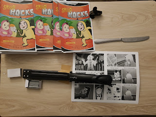
| My cheap long arm stapler and butter knife bone folder |
For our project I bought a long arm stapler and I suggest you buy or borrow one as well. In the past they were prohibitively expensive and many of us resorted to folding our pages to reach the center or making a diy long arm stapler by hacking up a standard stapler. Neither option provided nice results. Currently there are plenty of cheap long arm staplers available through the typical online shops and although they aren’t perfect, they work a lot better than most hacks you could come up with.
Now I’d like to go over the creative process we used while making Soup Rocks. This isn’t necessarily the “right way” to go about making a comic but it was how we did it.
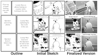
First, me and Danni brainstormed ideas and came up with a general plot. I created an outline of the events that occurred in the story and decided on a page count that I thought was obtainable with respect to our self-imposed deadline. Then I broke down the outline to the page count. For example, our protagonist shops for soup, buys a can, drives home, opens the can, and discovers rocks inside his soup as he begins cooking. I’ll admit, being that this was my first comic I was afraid that the pacing would be off, however, I felt that the aforementioned section of the plot could be summed up in two comic pages using 12 panels. I continued breaking down the plot to our page count and guessed what would feel like a good pace.
Next, I drew a series of squares and rectangles which represented the panels for the comic. In each square I described what I thought each image should look like with a generalized version of each speech bubble. After I finished drawing the rough panels I sent them over to Danni, who began sketching out the comic’s artwork. For drawing the comic’s panels, I used an open-source vector program named Inkscape.
Danni then sent me her interpretations of my panel descriptions. She illustrated her images in Photoshop, but if you are looking for a free raster drawing program, I suggest using Krita which punches well above its weight.
From there, I copied the panels into Inkscape, used the “Trace Bitmap” function and cleaned up the vectors whenever necessary. The reason I converted Danni’s art from raster to a vector is because I like rescaling artwork without worrying about any loss in quality. It’s also easier to make a more consistent color palette and I’m more comfortable editing vector points than redrawing artwork in a raster program.
Next, I exported the vectorized panels into Gimp, where I used gradients and the “Newspaper” extension to create the shading effects. Because I knew we were going to print in black and white, I colored in each panel with grey hues, added dithering every now and then, and paid close attention to how light or dark certain objects were. The exported panels served as my guidelines for the shading and coloring and remained near the top of my layers in Gimp.
I really liked the idea of using 3D/CGI backgrounds and props which could interact with Danni’s drawings in a cut and paste/collage/photocopied fashion. To achieve this effect, I looked at Danni’s illustrations and chose elements which could translate into 3D space. I then exported each panel as a reference to be used in the 3D modeling program Blender. In Blender I scaled the project’s camera to match the comic’s various panel sizes. I then modeled each element and exported my files from Blender, making sure I kept each background transparent. I then merged the 3D images with Danni’s artwork in Gimp. Most of the 3D images were stylized with dithering and the “Newspaper” effect. A similar technique is often used in manga; however, steps are typically taken to make the 3D images look like illustrations. In our case, I wanted to make sure our 3D renders look more like photocopied photographs.
Eventually, we settled on a more concrete script, plugged in some dialogue, and buttoned up our panel borders. There was a lot of back and forth between everyone but Danni and I understood our aesthetic/narrative goals and the pressure of meeting our deadline helped lead us to the finish line.
Making the comic was a ton of fun and I’d love to make more comic zines in the future. Maybe next time we’ll print a proper comic in full color using some sort of print company but for now I like our Lo-Fi black and white approach. Perhaps, one day, we can make a long form compilation in a manga/graphic novel format. Who knows!
We plan on eventually selling some copies of the zine online and when we do, I’ll be sure to update this page. As for now, you can check out a demo of our visual novel, which is based around a story by Danni with music and backgrounds by me and programming by Justin!
Shout out to all the people at the Zine Fest who traded zines, comics, and art with us. It was fun and we hope to see you at other art/zine events in the future!


No comments:
Post a Comment